Preply
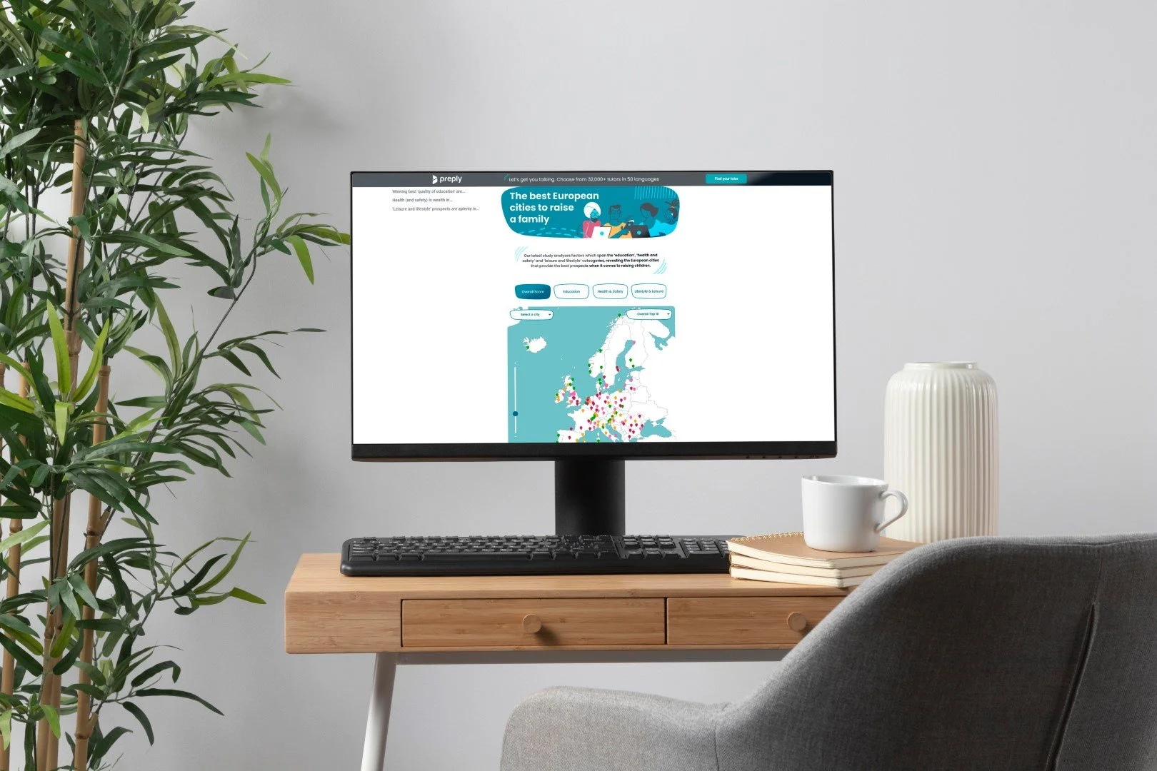
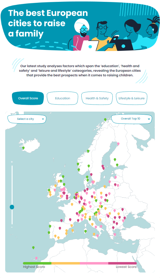
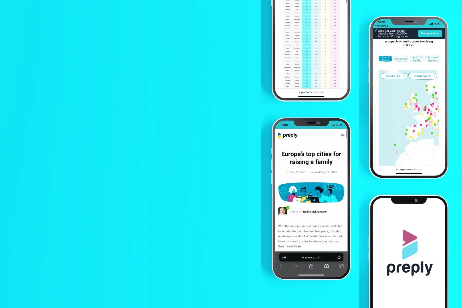
A responsive app for a blog post of a learning platform called Preply with the goal of informing people where is the best city to live in Europe in regards to 3 parameters.
Preply - Europe’s top cities for raising a family
Work for Type A Media
UI/UX Design
⏲️ Duration
6 weeks
Focus on UI/UX Design
Responsive App
👨💻 Role
UI Design
Styleguide Design
📝 Methods
Usability Testing
Competitive Analysis
Research
UI Design
🧰 Tools
Figma
Illustrator
📦 The Product
A responsive app for a blog post of a learning platform called Preply with the goal of informing people where is the best city to live in Europe in regards to 3 parameters.
🎯 The Goal
Getting people’s attention and getting more clicks throughout multiple blogs and posts in order to get more people into using the platform and give the users good information.
🗠 Method
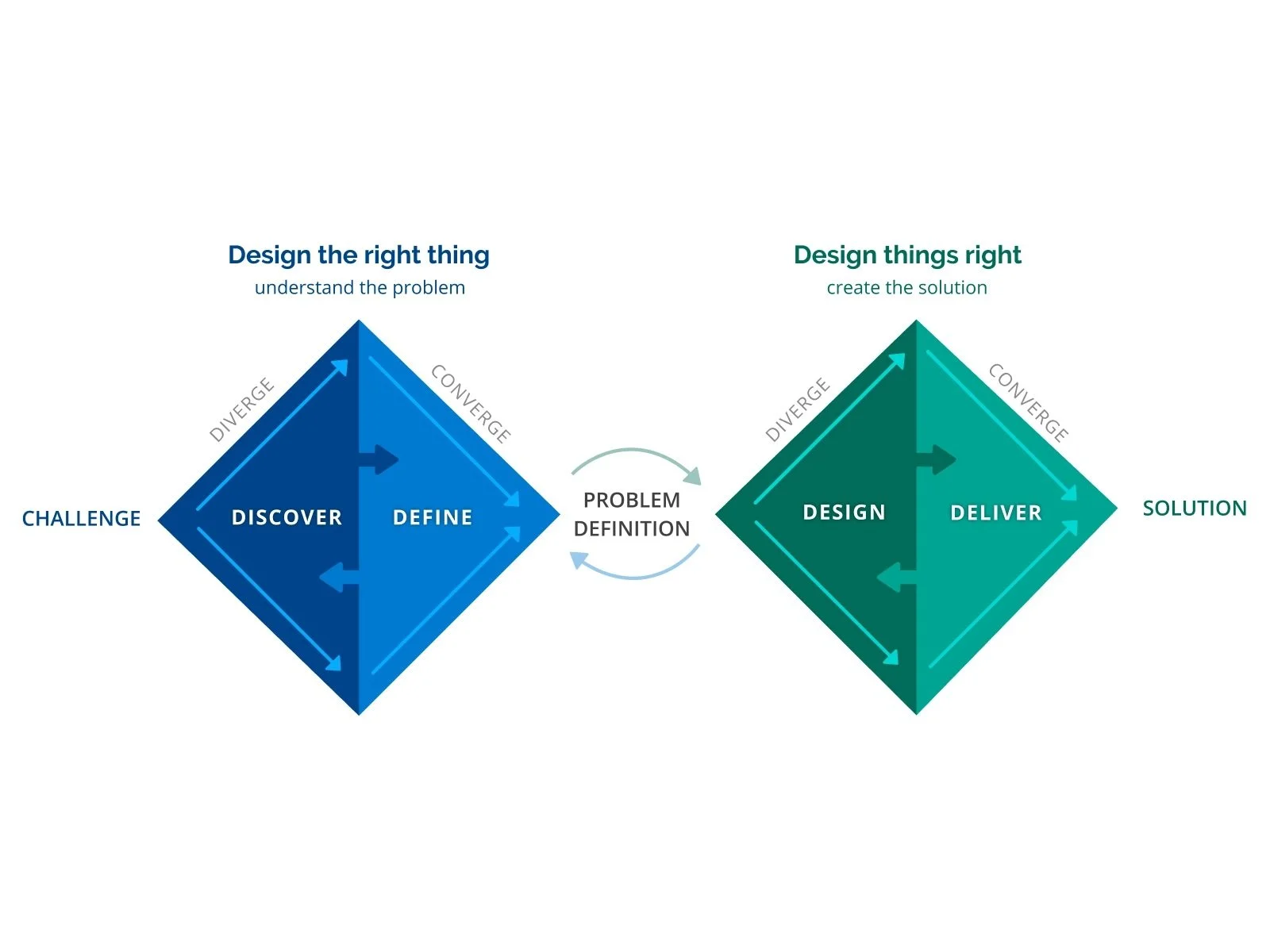
We used the double diamond method in collaboration with the client who had most of the data from the users and visitors on their platform. So we mostly enter phase 2 of the project where we helped with what the client might have wanted and to help define their problems in content and what was most used by users and visitors alike.
🚩 THE PROBLEM
We got to the conclusion that most clickable content on the internet is presented in a way that is always flat and in text or infographics. The user rarely interacts with the content of that page or stays there to explore more of the content of the website.
We tried to deliver the same blog posts with more interactive aspects and information.
✏️ IDEATION/UI DESIGN
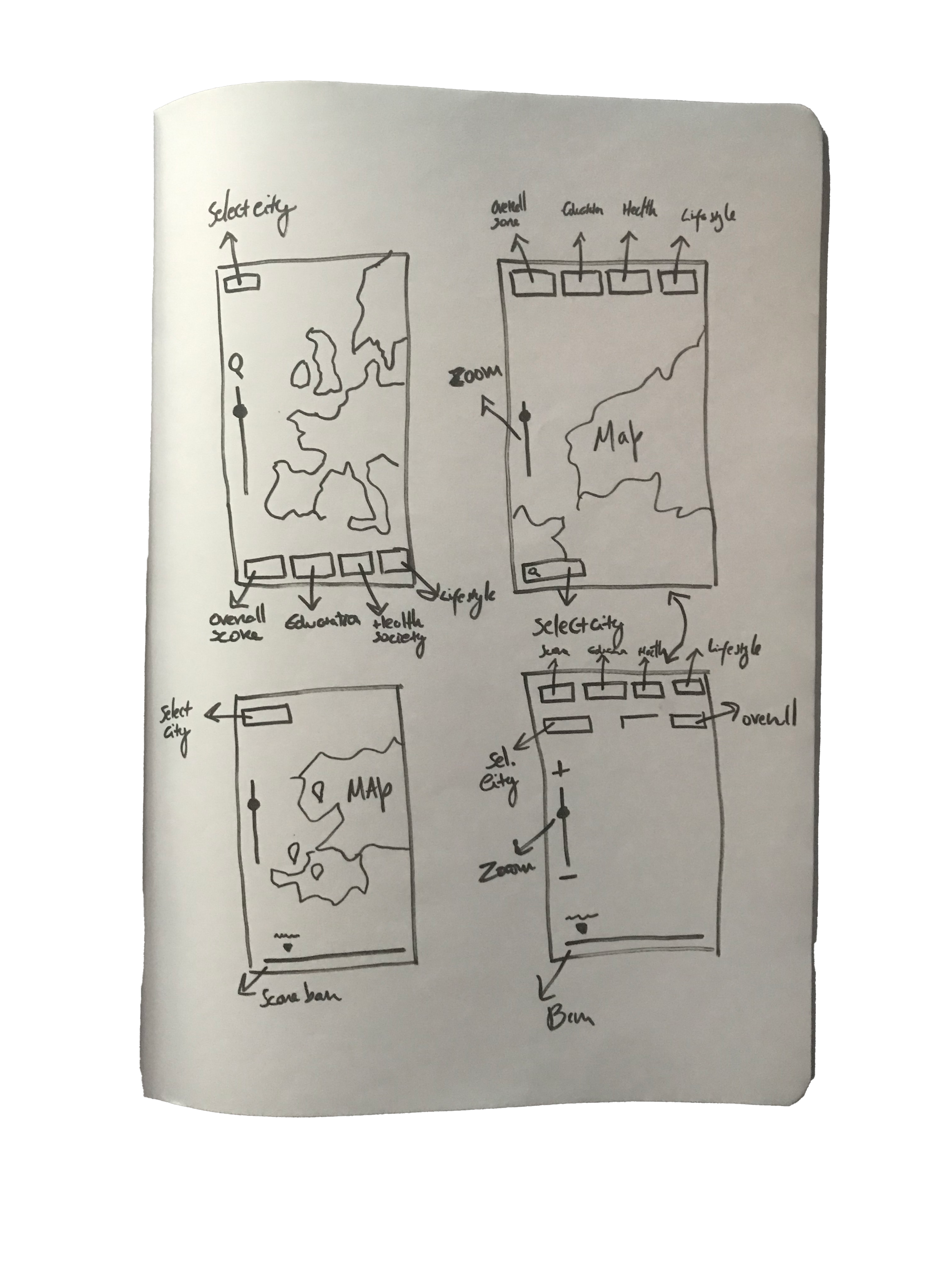
In order to generate ideas for this project, I first used the Crazy Eights method to see what I could glean from various "crazy thoughts." I quickly got to the conclusion that an interactive map with the best solution for this project.
We started using a simple wireframe for the map and see how users could interact with it.
The client wanted this to be an app that would work seamlessly on both mobile devices and desktop environments.
We started by doing the wireframes with the brand guidelines of the client, as most of the buttons and stuff were already done and ready to iterate in prototypes. So we took an approach of prototyping and wireframing at the same time, as the client wanted this done asap. The “wireframe prototype” we ended up with would be nearly the final product.
We began developing the screens in Figma after the first round of sketches was completed.
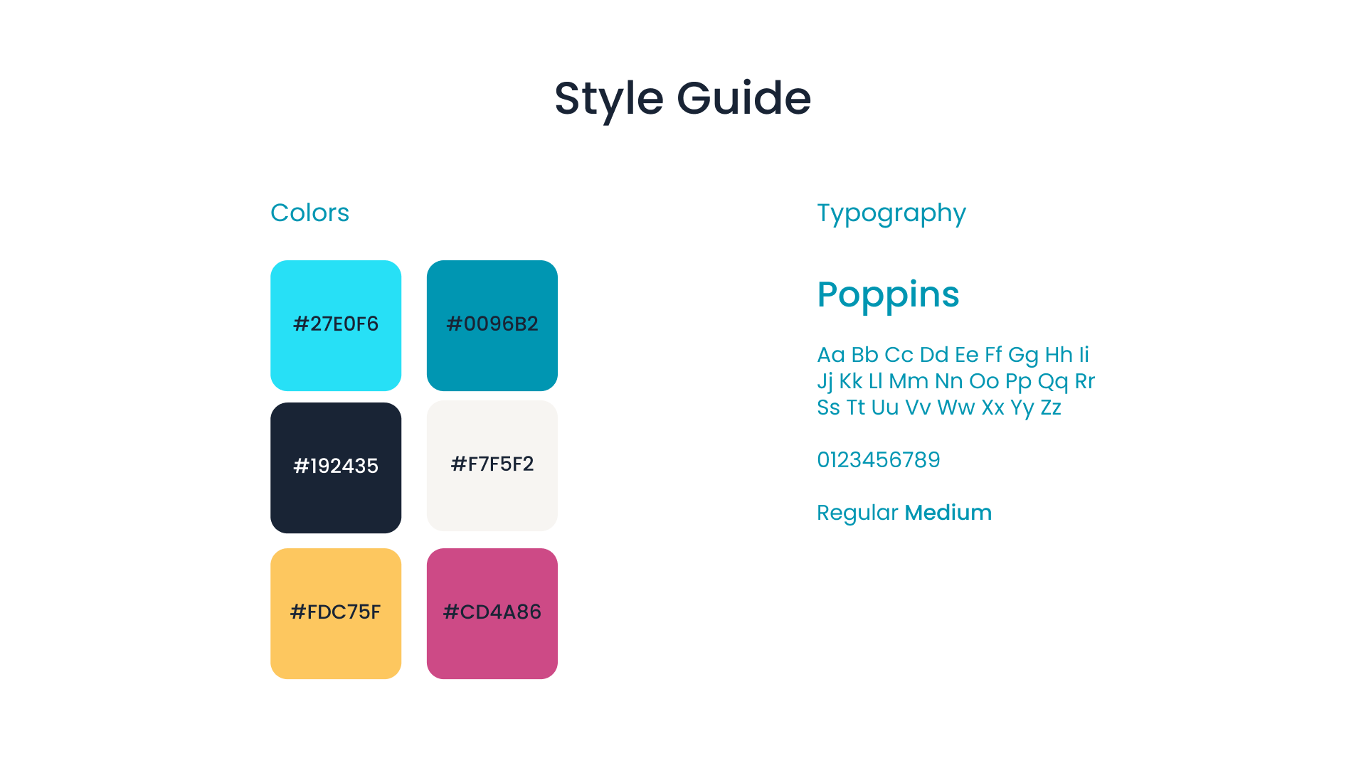
All the colours and clean layouts were already designed by the client.
We mostly adhere to three aesthetic trends: visual prominence, elegance, and cleanliness while implementing the brand guidelines and visual style already done.
This app was made for web browsers across a variety of platforms such as tablets, mobile phones, PC desktops and laptops
🚀 Deployment
Within the next 2 weeks the responsive app was done and coded and ready to be deployed.
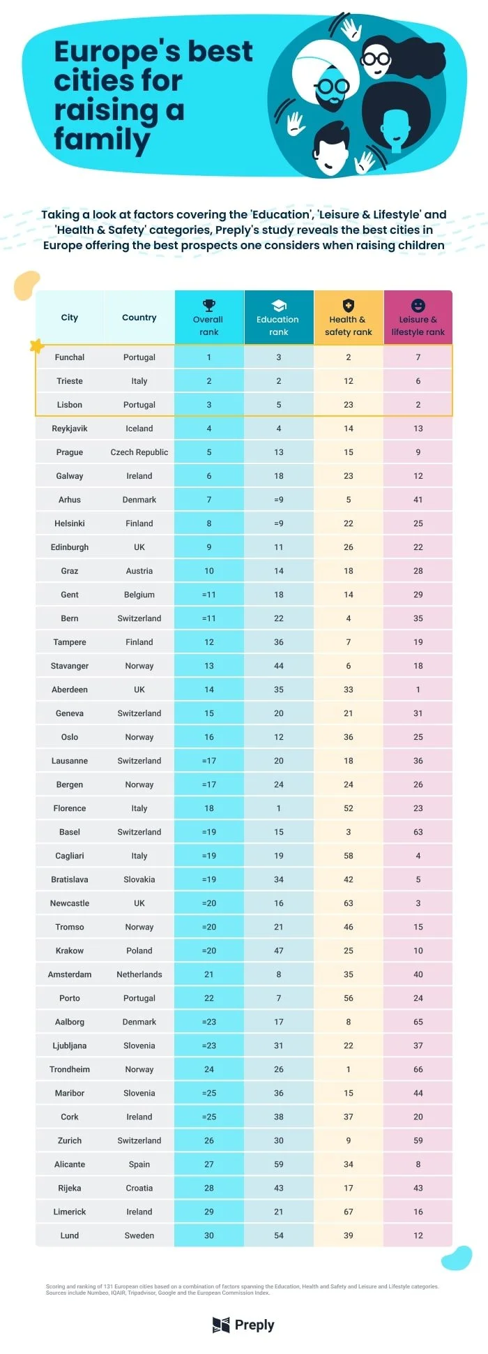
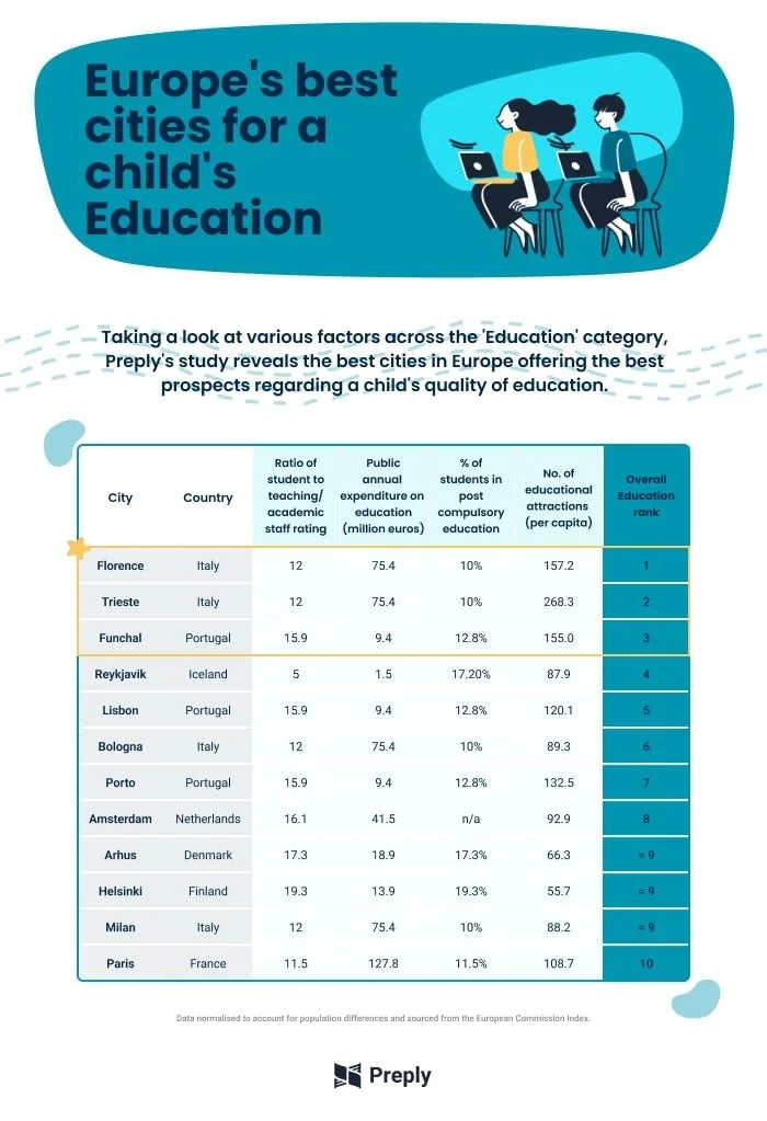
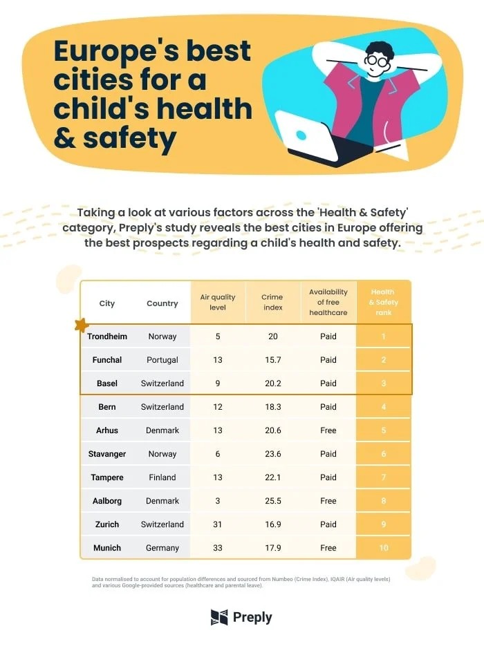
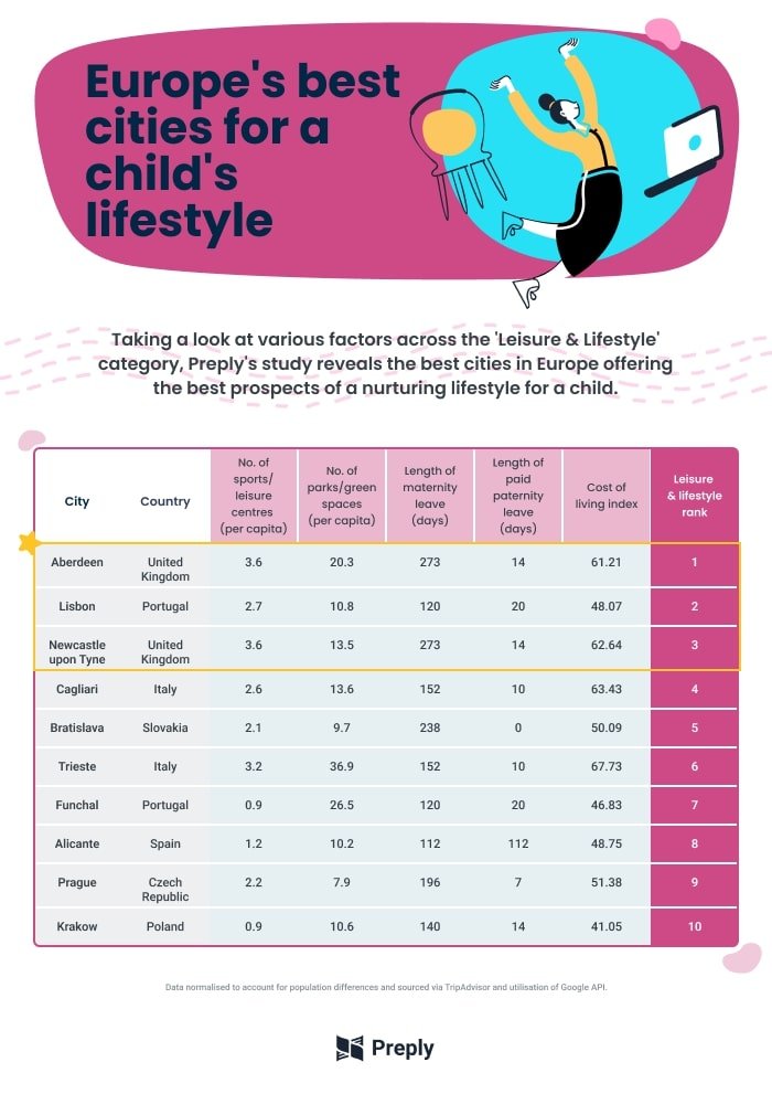
The client also wanted the content to have 3 infographics to go with it so we could more attention and have a summary of some of the categories of it. You can see the result of it below:
In the end, the same post got translated to 2 other languages, German and Polish and where posted in those different versions of the platform. I will link the final result below so you can access it and see how everything works.
Europe’s Best Cities To Raise A Family (preply.com)


