Cotswold Outdoor
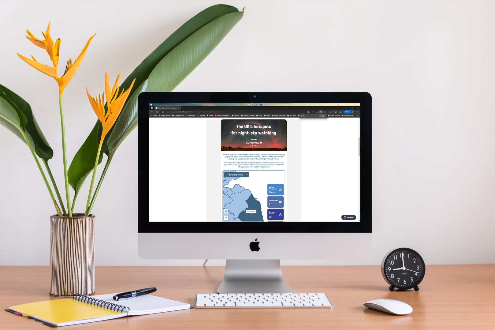
A responsive app for a blog post of an Outdoor shop called Cotswold with the goal of informing people where is the best county to watch the Night-sky shows and events.
Cotswold - Best Night-sky shows
Work for Type A Media
UI/UX Design
⏲️ Duration
6 weeks
Focus on UI/UX Design
Responsive App
👨💻 Role
UI Design
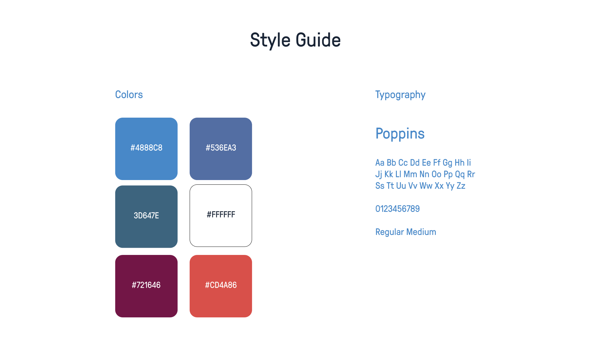
Styleguide Design
📝 Methods
Usability Testing
Competitive Analysis
Research
UI Design
🧰 Tools
Figma
Illustrator
📦 The Product
A responsive app for a blog post of an Outdoor shop called Cotswold with the goal of informing people where is the best county to watch the Night-sky shows and events.
🎯 The Goal
Attracting attention and generating more clicks through a variety of blogs and posts will increase platform usage and provide users with useful information.
🗠 Method
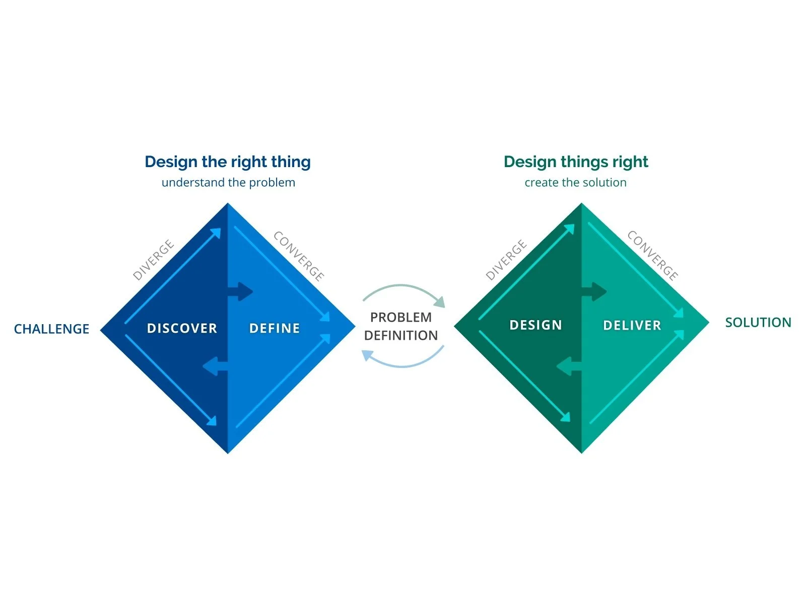
Together with the customer, who had access to the majority of the user and visitor data on their site, we used the double diamond method. Thus, we primarily move into phase 2 of the project, where we helped establish the client's difficulties with content and what was most frequently utilized by users and visitors alike.
🚩 THE PROBLEM
We came to the conclusion that most clickable content on the internet is presented in a flat, text- or infographic-based manner. Rarely does the user interact with the page's content or remain there to read more of the website's material. The same blog posts were updated to include more information and interactive elements.
✏️ IDEATION/UI DESIGN
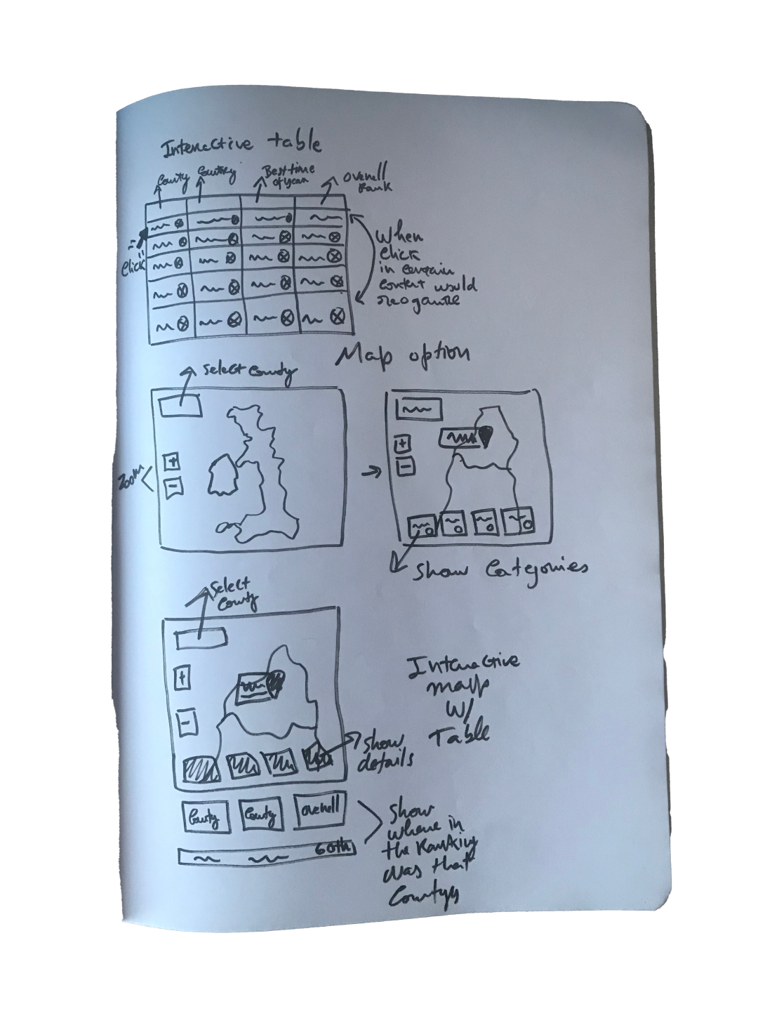
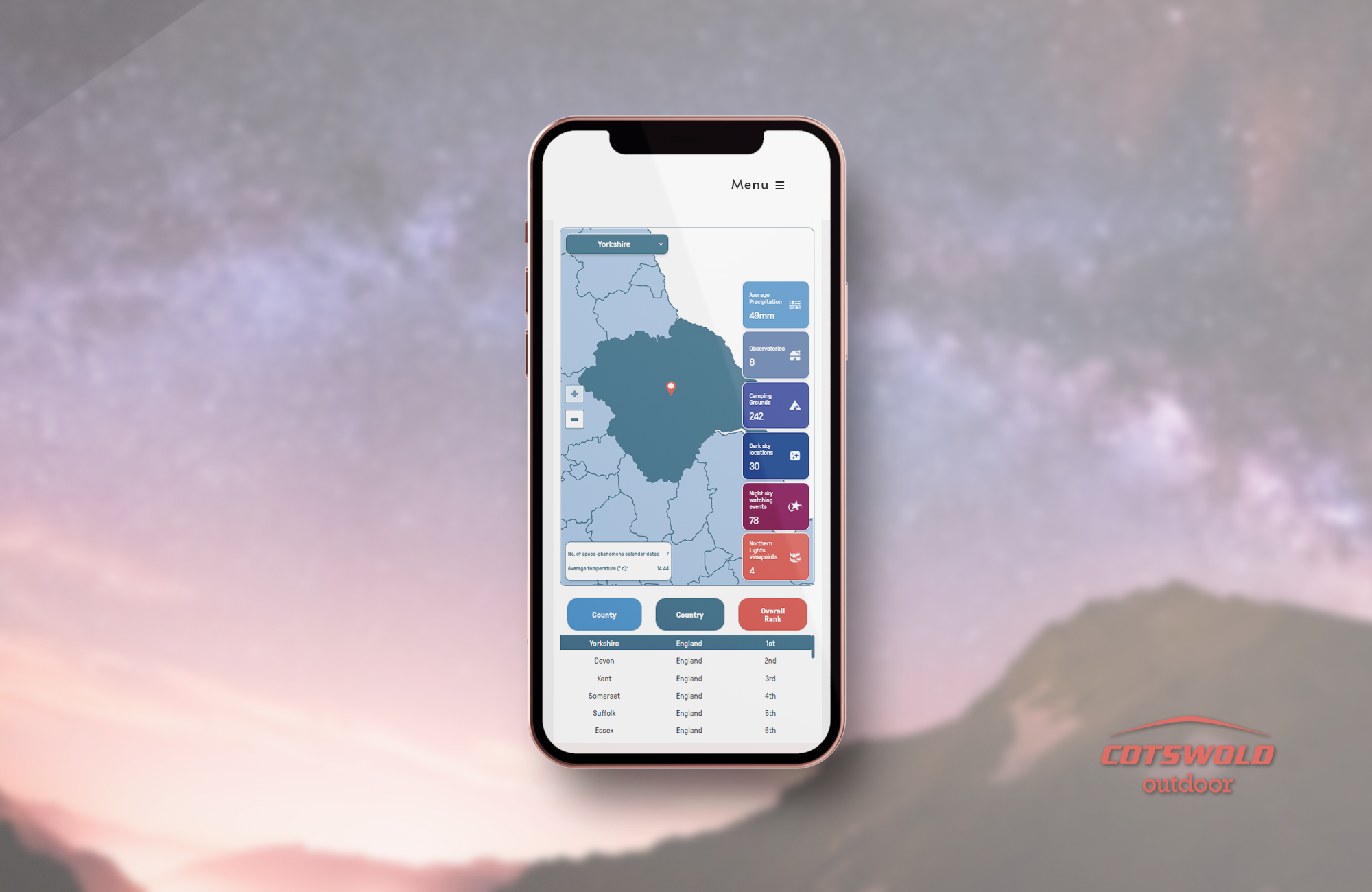
I used the Crazy Eights method to explore what I might learn from various "crazy thoughts" in order to come up with ideas for this project. I tried to avoid the fact that I have done previously a interactive map and not do another one, I gave the option of doing an interactive table that would show the user the ranking of the county depending on the category selected and then give a map of overall rankings in an infographic below, but the client didn’t like the idea and thought would be better to grab that idea and mash it with an interactive map. I followed the instructions although wasn’t the best user-centred thing to do because the restrictions of the blog post would put the responsive app space at risk, sometimes we need to work with restraints that are over the style guidelines.
For the map, we first created a basic wireframe to test how users would interact with it.
The client requested that this app operates without a hitch on desktop and mobile platforms.
Since most of the buttons and other components were completed and prepared for iteration in prototypes, we began by creating wireframes using the client's brand guidelines. We also adopted a strategy of concurrent prototyping and wireframing because the client needed this done pretty quickly. We did come up with a "wireframe prototype" that would resemble the final piece.
After finishing the initial concepts, we started working on the screens in Figma.
The client had already created the crisp layouts and all the colours. While implementing the brand rules and visual style that have already been created, we mostly adhere to three aesthetic trends: visual prominence, elegance, and cleanliness.
🚀 Deployment
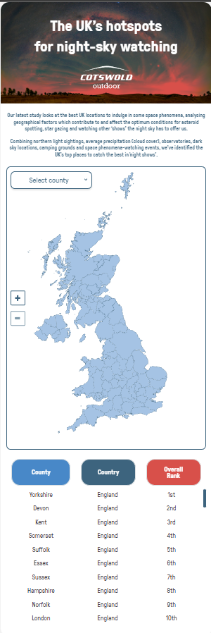
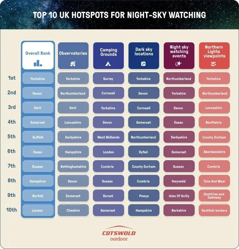
The responsive app was finished, programmed, and prepared for deployment within the following two weeks. In order to draw greater attention to the information and provide an overview of the overall ranking, the customer additionally requested that one infographic accompany it. Below, you can see how it turned out:
I'll provide a link to the finished product below so you can access it and see how it all comes together.
Best Night-Sky Shows | Cotswold Outdoor


